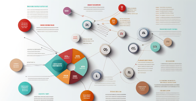
Designing an infographic is a great way to present complex information in a visually appealing and easily understandable format. However, there are some common mistakes that designers often make when creating infographics. These include overcrowding the infographic with too much information, using too many colors or fonts, lacking hierarchy, ignoring white space, incorrect use of data visualization techniques, and neglecting branding. To avoid these mistakes, designers should aim to simplify their design, use a limited color palette and stick to a few fonts that complement each other well, create clear hierarchy within their designs, use white space effectively, ensure appropriate use of data visualization techniques, and include branding elements that align with their company's overall brand identity.
Common Mistakes to Avoid When Designing an Infographic
Designing an infographic is a great way to present complex information in a visually appealing and easily understandable format. However, there are some common mistakes that designers often make when creating infographics. Here are some of them:
1. Overcrowding the Infographic
One of the most common mistakes made by designers is overcrowding the infographic with too much information. This can make it difficult for viewers to focus on the key points and can also make the infographic look cluttered and unattractive. To avoid this mistake, designers should aim to simplify their design and only include the most important information.
2. Using Too Many Colors or Fonts
Another common mistake is using too many colors or fonts in the infographic. This can make it difficult for viewers to distinguish between different sections or topics, and can also make the infographic look messy and unprofessional. Designers should aim to use a limited color palette and stick to a few fonts that complement each other well.
3. Lack of Hierarchy
Hierarchy is essential in any good design, including infographics. Without hierarchy, viewers may struggle to understand which pieces of information are most important and what they should focus on first. Designers should use techniques like varying font sizes, bolding text, and using contrasting colors to create clear hierarchy within their designs.
4. Ignoring White Space
White space, or negative space, is the empty area around elements in a design. Ignoring white space can make an infographic look cramped and cluttered, making it difficult for viewers to focus on individual elements. Designers should aim to use white space effectively to give their designs breathing room and help guide viewers' eyes through the infographic.
5. Incorrect Use of Data Visualization Techniques
Data visualization is a powerful tool for communicating complex information in an easily understandable way. However, using data visualization techniques incorrectly can lead to confusion and misinterpretation of the data being presented. Designers should ensure that they are using appropriate data visualization techniques for the type of data they are presenting, and that these techniques are used correctly throughout the infographic.
6. Neglecting Branding
While it's important not to overcrowd an infographic with too many elements, designers should still take care to include branding elements such as logos, colors, and fonts that align with their company's overall brand identity. Neglecting branding can make an infographic look unprofessional and disconnected from the company it represents.